Textile Essentials and Layering in Interior Design
Last updated on October 29th, 2024
Designers know that a great space isn’t the result of a single piece or even a certain budget. The real key to a well-designed room is how everything is assembled—how individual elements are layered to create interest and give a room true personality and character.
Even in minimally designed rooms with the most neutral of color palettes, the integration of different textiles can add a much-needed depth that makes all the difference. That’s why the textiles are my favorite part of any design.
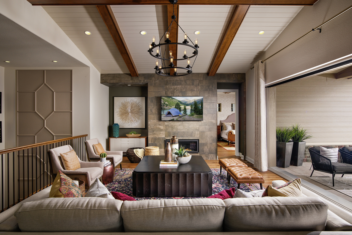
When we’re designing spaces, we look at three key factors when it comes to the textiles. These considerations be applied in virtually any scenario to elevate the design in your own home.
1. Intent
What is the design story you’re looking to tell? Is your aesthetic mid-century modern? Urban eclectic? Classic farmhouse? That will drive your textile palette. The same couch can tell half a dozen stories based on the textiles that surround it.
For the Orion model in Vista Point at Southshore, the design story was deeply tied to the lake lifestyle. The combination of colors and patterns is diverse, but all are designed to create a harmony between indoor and outdoor living.
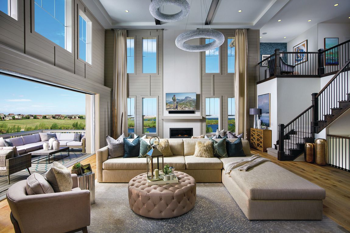
2. Contrast
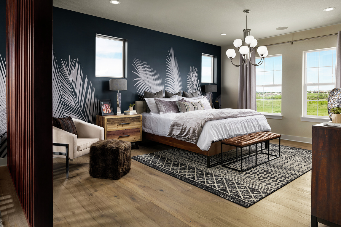
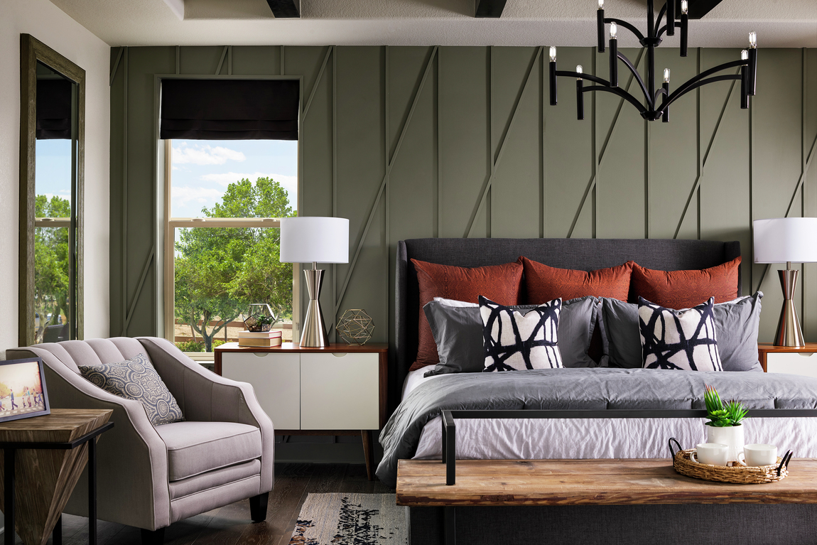
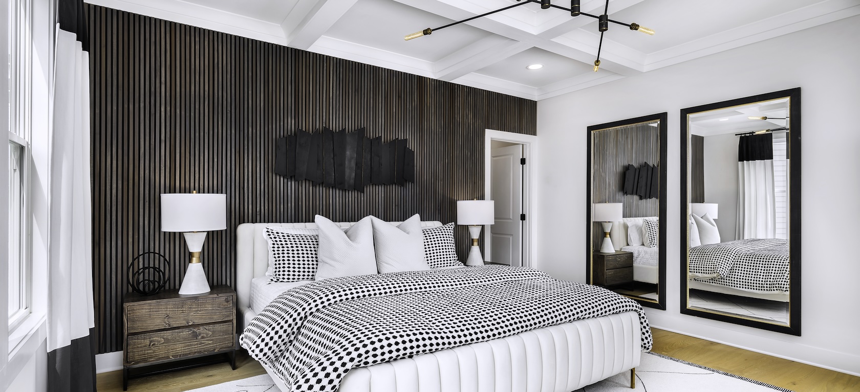
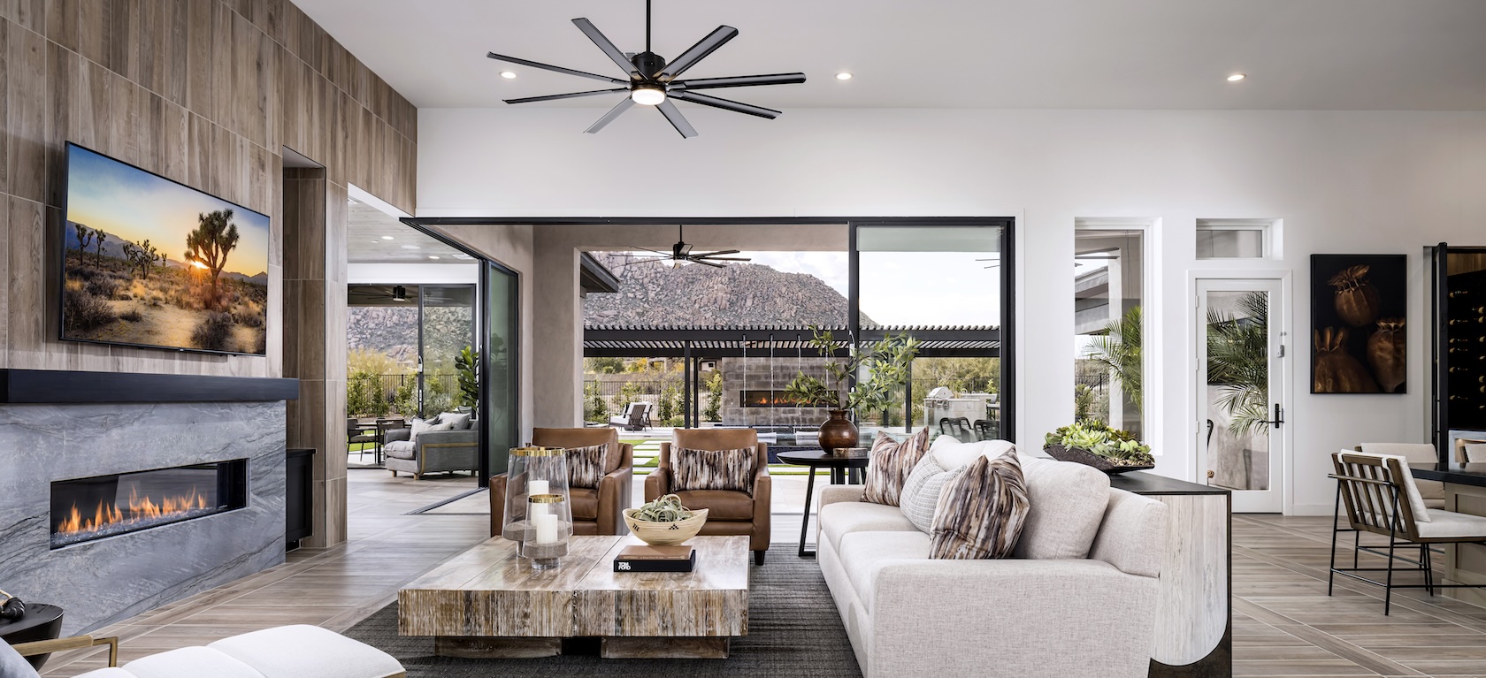
Once you have your general design intent identified, think about ways to create contrast. We always look to create a juxtaposition of both color and texture. Even with a tone-on-tone palette, we look for a diversity of textures to ensure the space feels interesting.
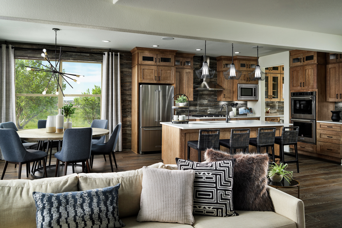
In the Valmont model in Toll Brothers at Candelas in Aurora, Colorado, our goal was to use a globally influenced textile palette.
3. Scale
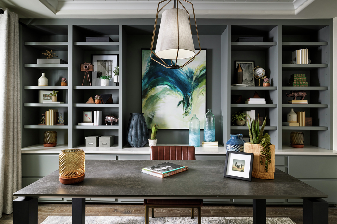
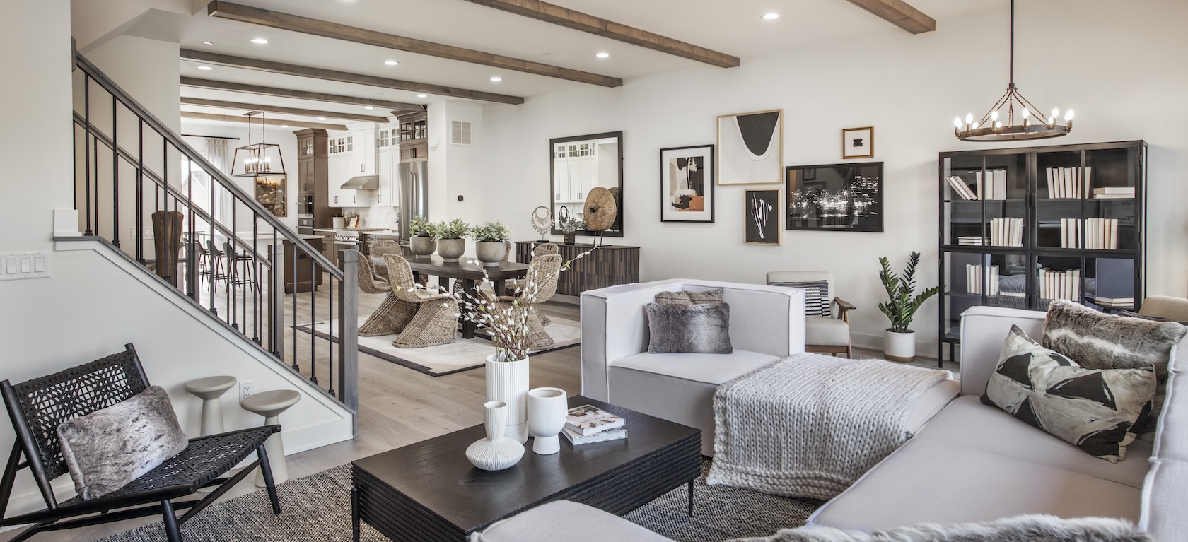
I’m a big fan of layering different patterns. To achieve this look, pay attention to the scale and relationship of your patterns. More specifically, be sure to vary the scale. Don’t do three to five huge patterns. Look for a combination of small, medium, and large-scale patterns united by the design intent and you’ll get a more cohesive look.
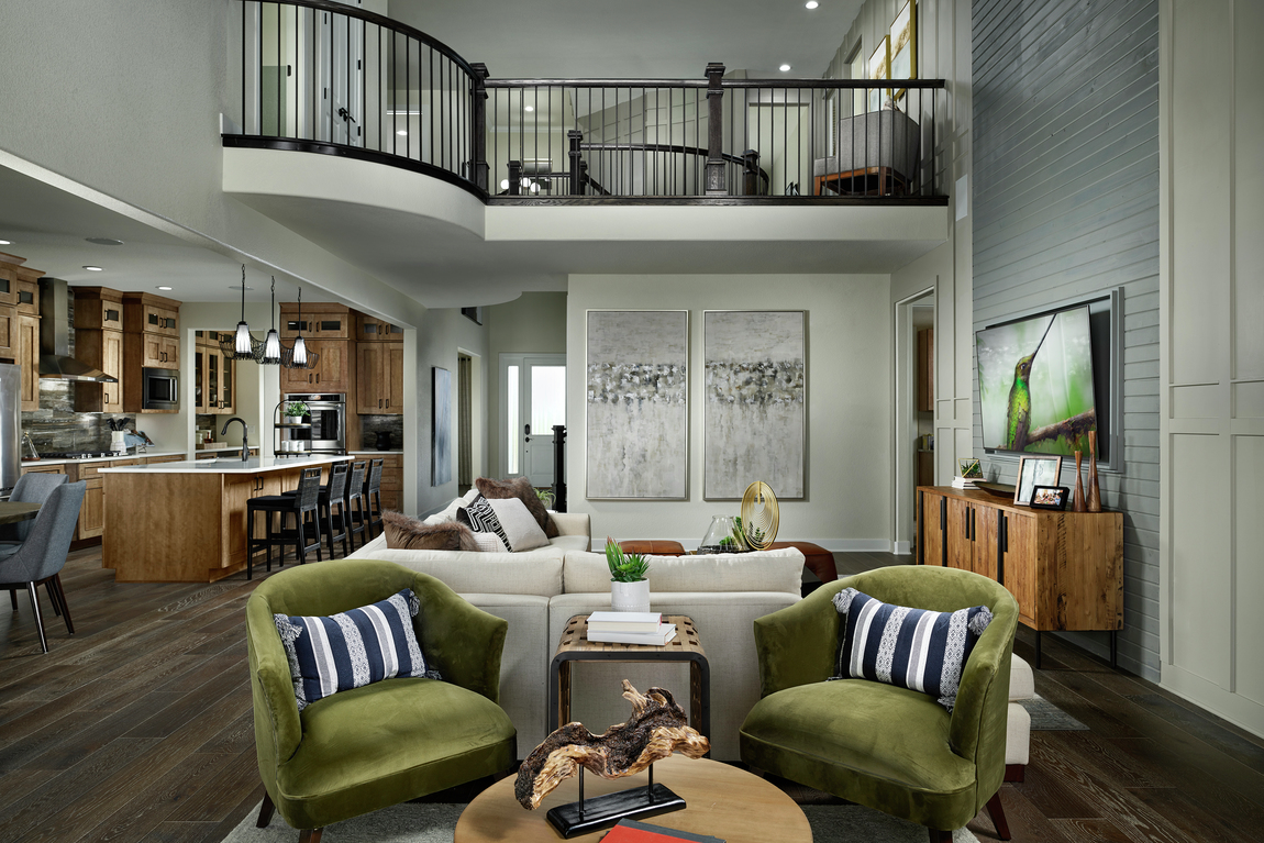
For The Point collection in the North Hill community, we layered a variety of textures and colors. Rich blues and greens, faux fur and black and white patterned pillows combine to create a cohesive tableau that fits within the broader context of a design that maximizes connection to nature.
Finally, and most importantly, make sure that whatever you put in your home feels true to you and what you love. If you fill your home with the things that bring you joy, you’ll naturally begin to layer colors and textures and over time, you’ll create a style that is all your own.
*Angela Harris, CEO and Principal of TRIO, contributed to this story

2 Comments
Greetings from New Jersey! I am having trouble deciding on tv location in my yet to be built (October 2000 closing date) Toll Brothers home at Regency at Freehold, Linwood model. There was no model for ideas. I extended family room and added direct vent fireplace in center with windows on each side. I also extended breakfast area. My question is do you think there is enough room on wall in family room for tv and built ins or should I stay safe and put tv over fireplace. If I do built ins, sofa will need to be near 6 ft farmhouse kitchen table. Any suggestions would be appreciated. Stay safe and cheers. Lisa
Hi Lisa, I am reaching out to my team to see if we have a suggestion for your TV location. I’ll let you know as soon as I come across one. Thanks!