Sherwin-Williams 2018 Colormix® Forecast and Color of the Year
Last updated on October 29th, 2024
Each year Sherwin-Williams identifies color palettes by drawing from fashion, nature, pop culture and global design to create the Colormix® Forecast. The collection predicts the colors that will drive conversation and inspiration for the coming year, offering new perspectives on societal influences and their impact on color and design trends.
From vivid blue and digital green, to high-def yellow and rusty auburn, the Sherwin-Williams 2018 Colormix® Color Forecast exhibits three unique color palettes that draw from emerging global trends.
The Color Forecast team, led by Sue Wadden, director of color marketing, identified 36 colors and then categorized them into the three Colormix palettes: Sincerity, Unity, and Connectivity.
Sincerity
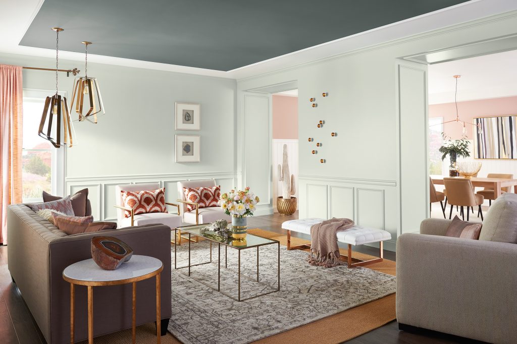
This palette emerged from the growing need for minimalism, daily meditation and the concept of lagom, meaning “just enough.” The hushed tones of Sincerity play out in sand, complex grays and hazy botanicals. There are no harsh lines, but rather, blending and fluid movements that create peace and space.
- Less Brown SW6040
- Sashay Sand SW6051
- Wheat Penny SW7705
- Alluring White SW6343
- Rojo Dust SW9006
- Shell White SW8917
- Acacia Haze SW9132
- Homburg Gray SW7622
- Functional Gray SW7024
- Malabar SW9110
- Song Thrush SW9112
- Pearl Gray SW0052
Unity
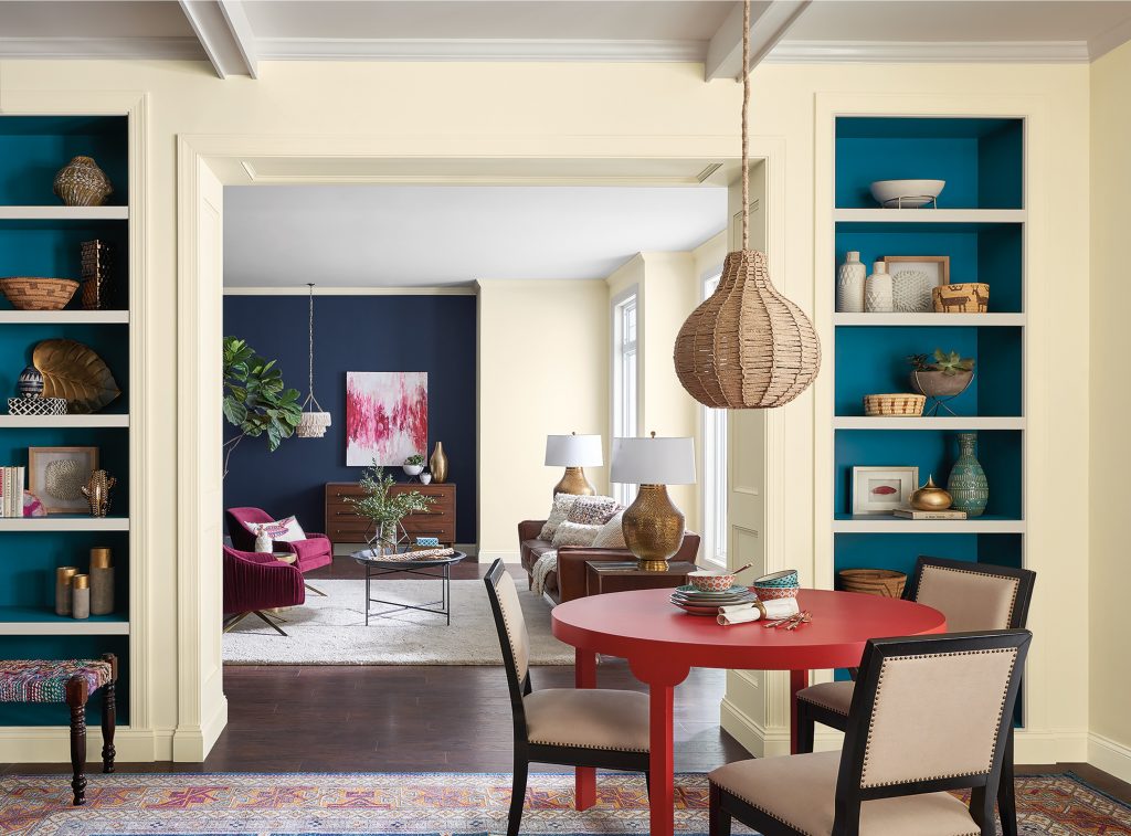
The Unity palette reflects the developing need for roaming as we seek to make connections with new places and cultures, and the celebration of indigenous patterns and artisan crafts we find along the way. The bright folklore of this story is told in memorable pops of peacock color, animated fuchsia, and grounded browns.
- Tamarind SW7538
- Borscht SW7578
- In The Navy SW9178
- Tatami Tan SW6116
- Adrift SW7608
- Rockweed SW2735
- Honey Bees SW9018
- Exuberant Pink SW6840
- Indigo SW6531
- Heartthrob SW6866
- Oceanside SW6496
Connectivity
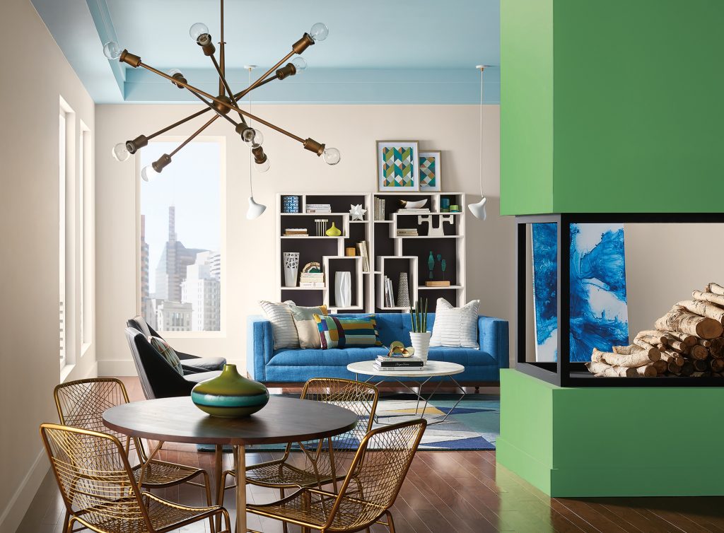
Inspired by the progressive movement of virtual reality, productivity, and youth culture, the high-tech Connectivity palette serves up colors we crave: pixelated in orange, violets, digital greens, and high-definition yellow
- Hunt Club S6468
- Overjoy SW6689
- Jay Blue SW6797
- Cavern Clay SW7701
- Black Swan SW6279
- Ibis White SW7000
- Wisteria SW6822
- Reflecting Pool SW6486
- Organic Green SW6732
- Billowy Breeze SW9055
- Grape Harvest SW6285
- Queen Anne Lilac SW0021
The 2018 Color of the Year
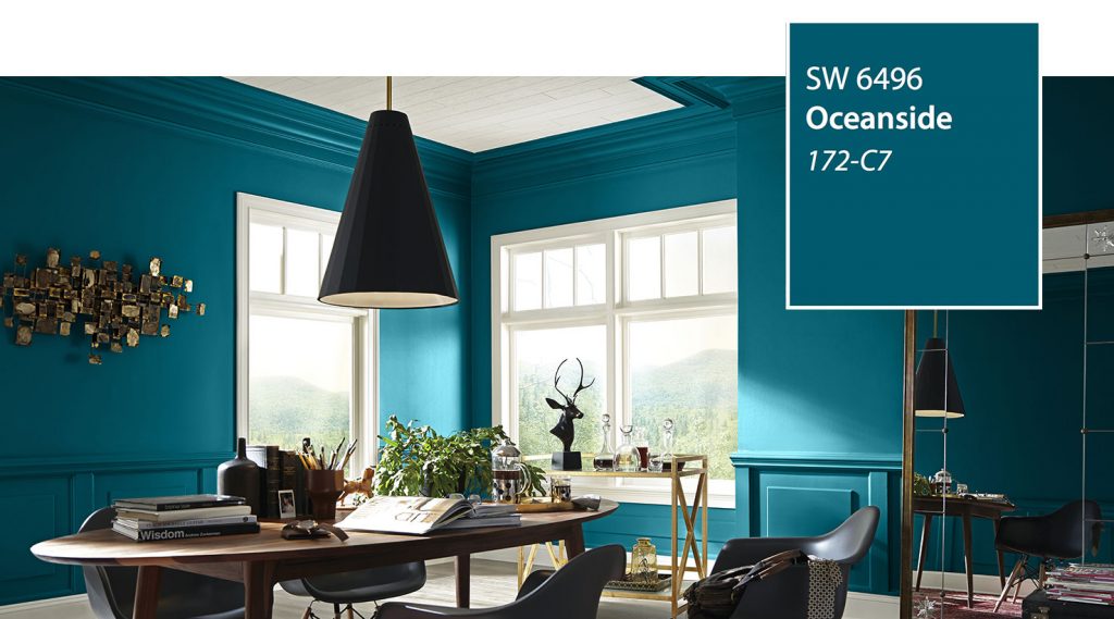
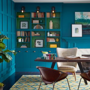
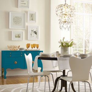
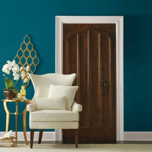
A selection from the Unity color palette, Oceanside SW 6496 is the Sherwin-Williams 2018 Color of the Year. A fusion of rich blue with jewel-toned green, Oceanside represents the growing desire for color that is both accessible and elusive. A complex, deep color, this color offers a sense of the familiar with a hint of the unknown, bridging between old and new, light and dark.
Bringing the Color of the Year into the home
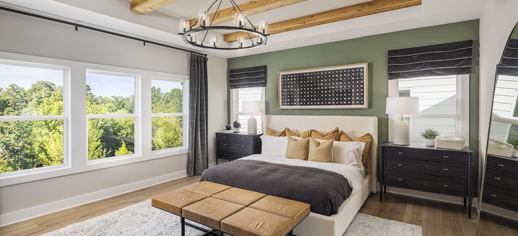
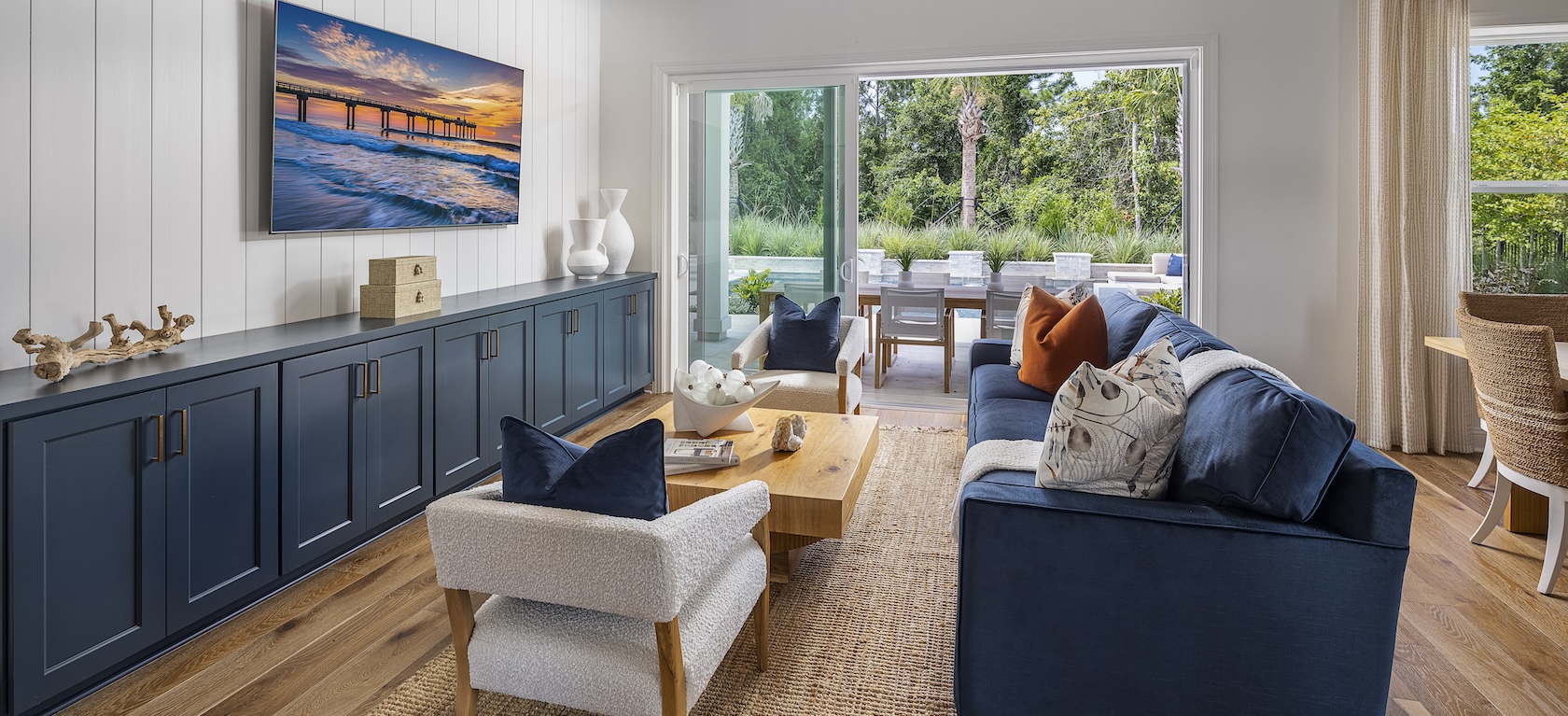
Blues evoke a multitude of moods and associations depending on hue, shade, and application. Despite this variety, they are universally perceived as intelligent, honest and interesting—making blue the most beloved color worldwide. Oceanside’s multi-dimensional look could create a welcoming statement as a lively color for a front door. This green-meets-blue tone can also boost creative thinking and clarity of thought in a home office, or invite meditation and introspection in bedrooms or reading nooks.
Oceanside’s versatility allows it to play well with many colors. It is a bright counterpart to equally eye-catching colors, such as Exuberant Pink SW 6840 or Honey Bees SW 9018, or it can rest relaxingly alongside other blues, such as In The Navy SW 9178 or Adrift SW 7608.
- Exuberant Pink SW6840
- Honey Bees SW9018
- In The Navy SW9178
- Adrift SW7608
It is also the ideal companion for corals and copper metallic tones. Oceanside is universally embraced by design styles from mid-century modern to Mediterranean-inspired, and traditional to ultra-contemporary.
Using the Sherwin-Williams ColorSnap® Visualizer, you can explore the Color of the Year and with the swipe of a finger see it on any wall.
Toll Brothers’ vendor partner Sherwin-Williams, the largest producer of paints and coatings in the United States, contributed to this story. Discover more about Sherwin-Williams 2018 Colormix Color Forecast and other color selection resources or learn more about the 2018 Color of the Year.

